|
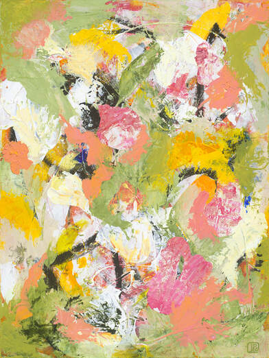
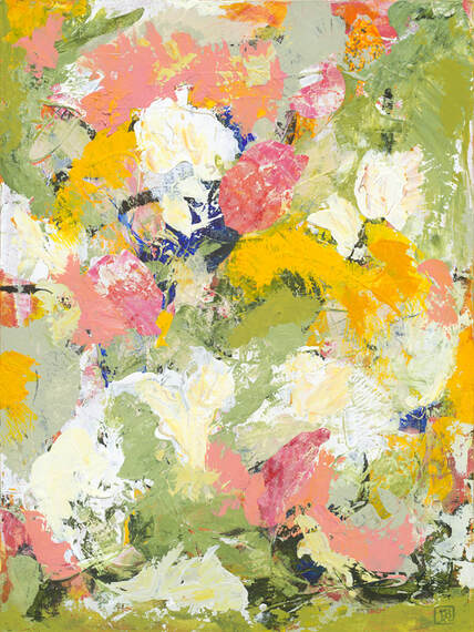
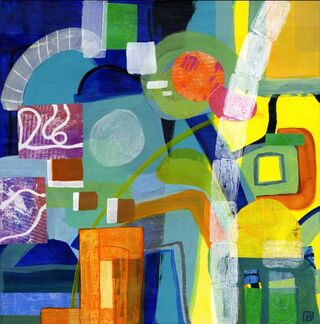
These two panels have a fun history. They were the first panels I worked on after we got back into our house/studio in the winter of 2021. After not having painted for 14 months, I gave myself permission to use them for experimentation. Over many months I painted, repainted, and then collaged over that until I thought I had something I liked, both geometric and abstract, with a feeling of things on edge.
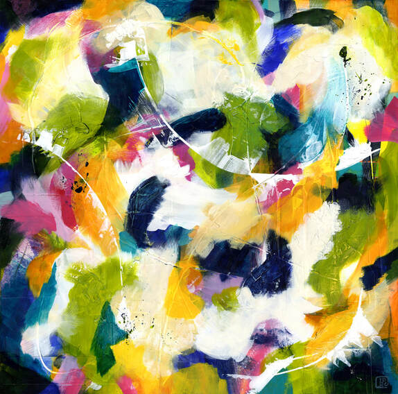
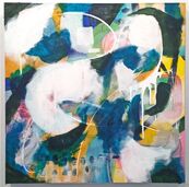
I let those sit for quite a few months, decided they were done, and even published their photos last spring. After that, I moved on to larger pieces with a much freer kind of painting and found my groove. Last month I looked back at those early panels and had no interest in them whatsoever! My painting style had moved on. So I took what I had created a year before and started over again. This time things flowed quickly. I loved the new color palette, and the past life of the panels gave these paintings extra depth and richness. I found the same dancing feeling I've been enjoying with my larger paintings, and voila! Starting Fresh 1 and 2 were born.
0 Comments
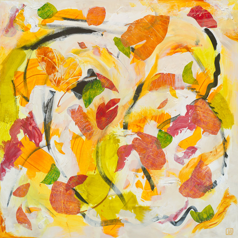
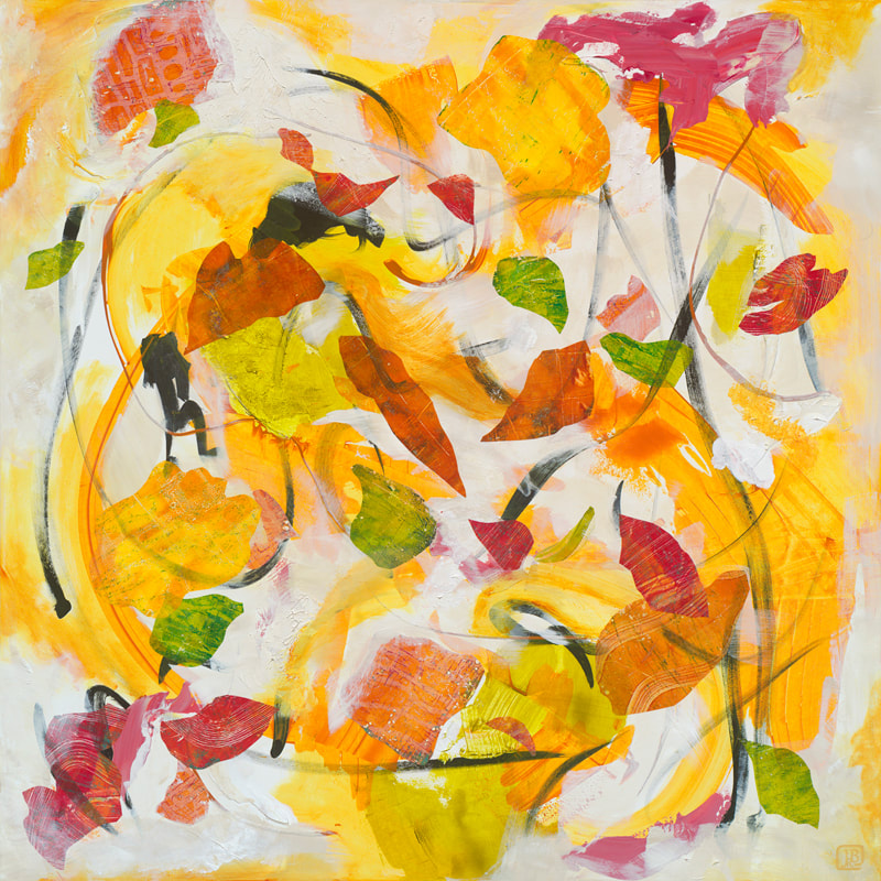
Windswept 1 (Process)Press Play Coming Home — Windswept 1. (30" square, mixed-media on cradled wood panel) Windswept 2 (Process)Press Play Coming Home — Windswept 2. (30" square, mixed-media on cradled wood panel) I'm happy to say I've been busy in the studio. Below are two of my latest paintings, Windswept 1 and 2, part of my Coming Home series. For me, they feel like an early autumn day when the sun's shining strong and wind takes off in a swirl, carrying leaves and twigs and anything else light with it. As an intuitive painter, I never know where a painting will end up. That's what's so exciting! You can see a bit of my process in the slide shows above.
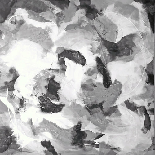
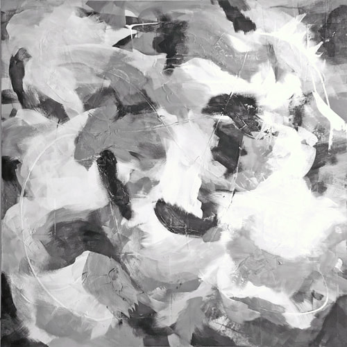
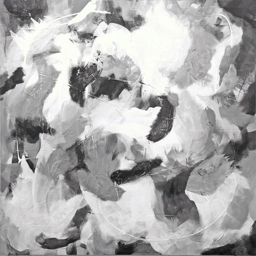
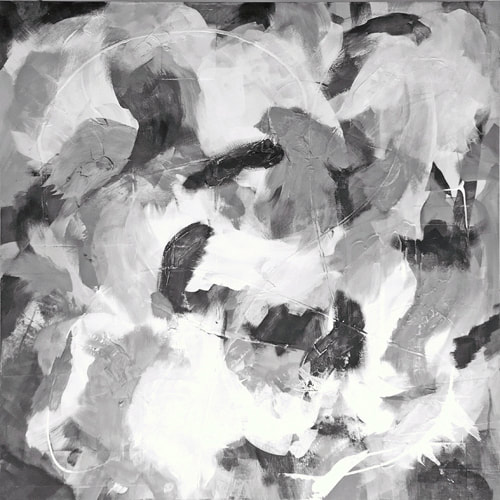
We had our first snow in New England this week! A wonderfully ironic time to share Summer Days from my Coming Home Series. One of the surprising things about our house/studio fire in 2020 is the change in my perspective on earlier paintings. Summer Days is actually a painting over a mixed-media painting called New Ground that survived perfectly because of its location. It was a piece I really enjoyed, but after the fire it felt too... controlled. I wanted to paint something freer! I decided to use it as the underlayer for a new painting, so I took dark blue and black and fluid white paint and began making loose marks over the original. Then I followed the feeling of those and added more high-contrast forms. I liked the texture of the collage and all the paint existing under the new work. Here are a few process photos to show you what that was like, including the ugly stages! When I thought the new painting was almost done, I tested out the balance by making these black and white images (eliminating color saturation). I turned Summer Days various ways to see how it was working best. I thought all the directions were interesting! The painting shown at the top of the post and below is what I finally decided on after many turns on the wall. I'd like to share these three smaller paintings with you. They're mixed-media works that feature several textural elements, including the brown accordion packing paper found in so many boxes!
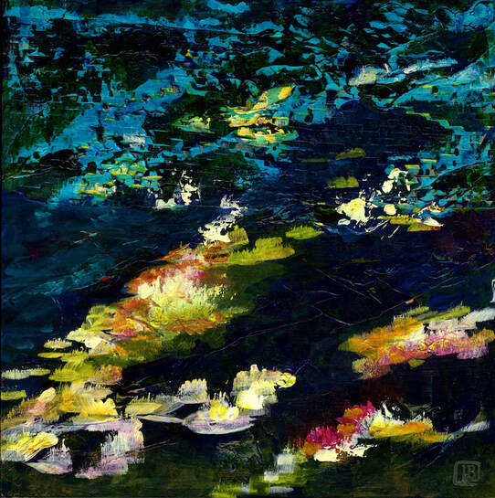
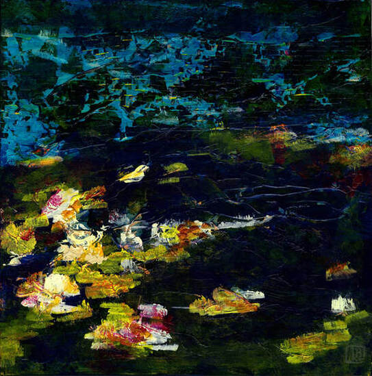
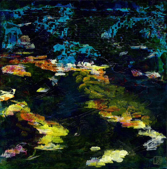
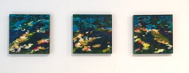
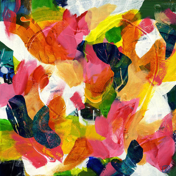
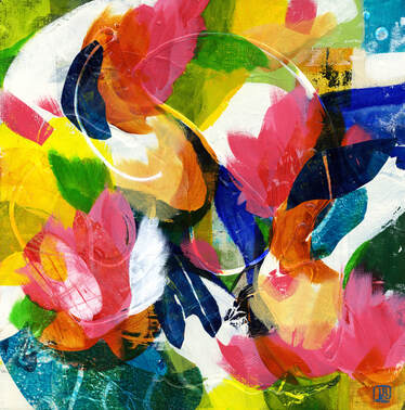
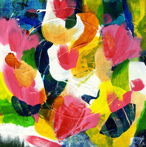
The paintings didn't start out the way they ended up at all, and that's fascinating to me. At some point pretty far in, my husband Jeff said "what would those look like upside down?" and oh what a genius question, because flipping them before completing them was just what they needed. Clearly they evolved into pond flora and reflections on water — their botanicals remind me of the Pre-Raphaelite paintings I've loved. I'd like to say that was my intention, but my process is much more intuitive and spontaneous than that. Each time I create, something flows from me to the painting surface and back again, and it's always a different experience. It's that exploration and unknown that keeps me so hooked! I don't think that experience is unique to the visual arts, despite how magical it sounds. I think it's especially true of what we call "creative," but also any process that isn't rote, that has various avenues one can take in many situations, where one has to think creatively and on the spot about how to solve something or make something better. Maybe you've experienced something similar yourself? I'm excited to share with you three more colorful mixed-media paintings in my Coming Home series. Each is unique, and they are connected through the joyful spirit that infuses them, as well as the free-flowing method of creating them. They are each acrylic paint plus collaged, hand-printed tissue and other papers. I hope you enjoy them!
|
AuthorI'm a mixed-media artist living and painting west of Boston. Exploratory and color-happy. Archives
June 2024
Categories |


 RSS Feed
